One of the many appeals of using Snowflake for me, is the user interface in the browser, which allows not only to perform many admin tasks, but also to poke around data. Yet, that legacy environment, while the envy of many competitors (Hi Redshift and BigQuery!), is still lacking many features necessary to perform analytical tasks, most notably the visualization aspects: no graph possible. Nevertheless, pursuing its vision towards becoming a one stop shop data cloud, Snowflake introduced in June 2020 a free preview for an exciting feature: Snowsight.
Snowsight originates from Snowflake’s first acquisition in March 2019, Numeracy. the goal is to enhance the experience by easing data exploration, SQL coding and provide visualization, still within the browser. I have to say, while this is still a preview, it is already very compelling… Let’s take a quick tour after selecting the preview from your regular Snowflake browser UI:

Data Discovery
After selecting the relevant schemas, all the tables are made available to pin on the workbench, featuring a convenient row count and a preview button:
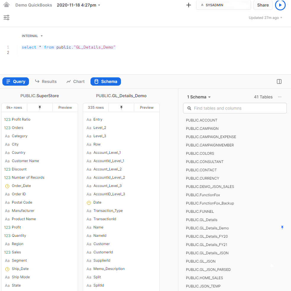
It is very responsive and convenient. I just wish a click on a field name could insert it in the SQL script, just like the Google BigQuery web interface allows… Also, views are not (yet?) available in the schema, only tables… to pursue your data exploration, you can click on the results button to get data profiling:
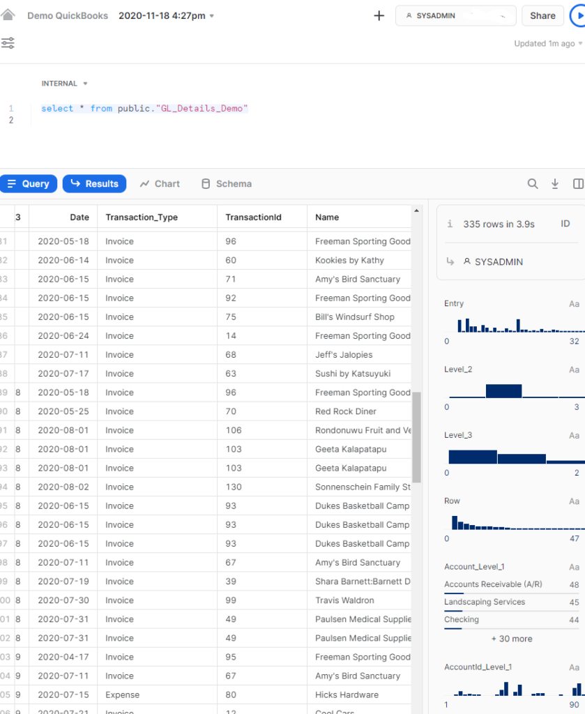
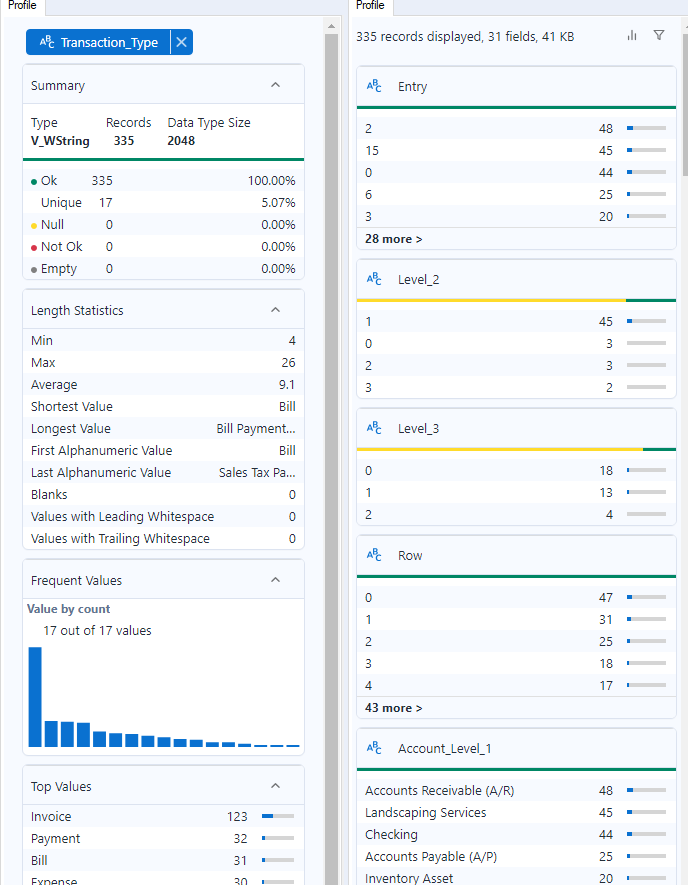
It is also very fast, convenient to get instant access to averages, sums and more of the column you select, with histograms, to find outliers and quality issues. That view is quite comparable to what Alteryx provides as well:
Visualizations
Similar to Tableau, you first build a chart within a worksheet, from a data source defined by a query:
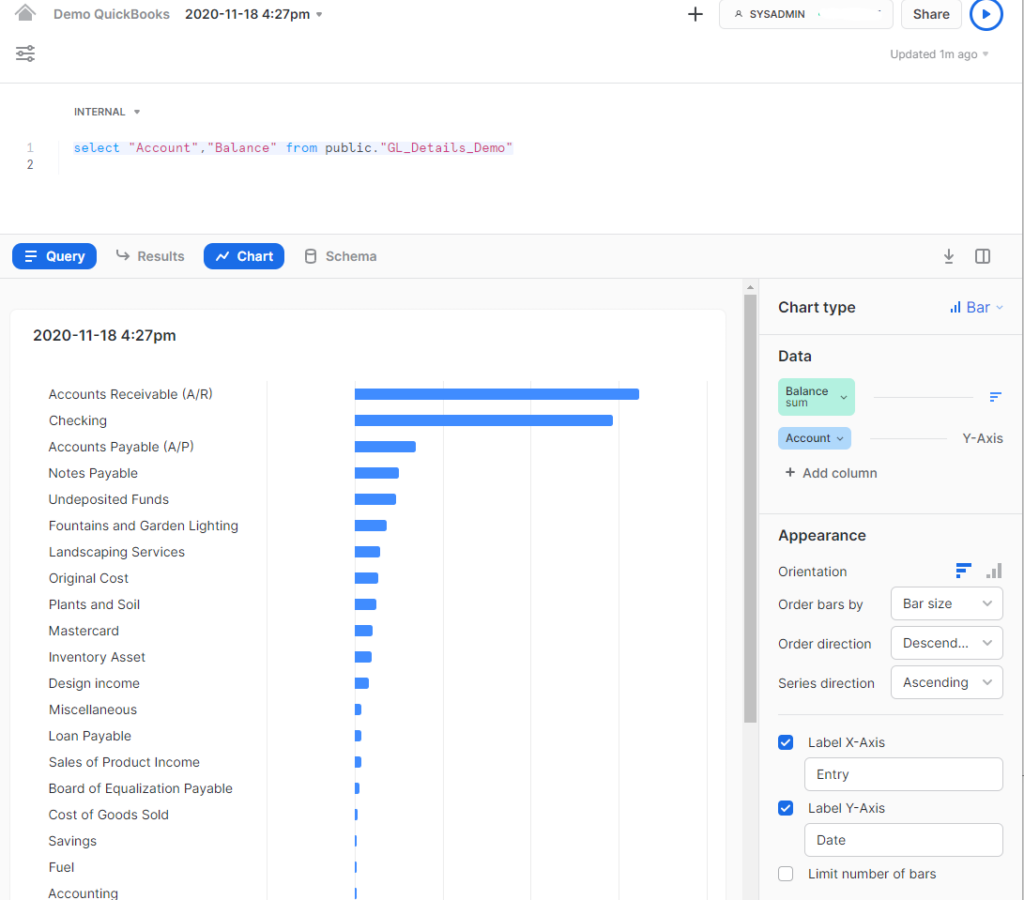
It will not compete with Tableau for the depth of options, closer to Google Data Studio but the minimum is there and is easy to manipulate, unlike GDS… There is a nice Export function to get an instant PNG image. You take one or many of those worksheet and assemble them into a dashboard:
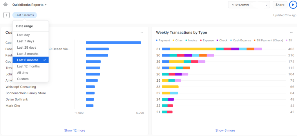
Note that if you remove a worksheet from a dashboard, that worksheet is deleted, which is an odd behavior… Also, the custom filter for date range is defined at the Admin level and can therefore be shared across dashboards. Those filters can use custom drop downs, configured using a query or by manually inputting a list. When using the query option, the resultant look-up list can be refreshed hourly, daily, or not at all.
Usability & Ergonomics
I find that usability is where Snowsight really shines, by astutely incorporating features of the best SQL IDEs, starting with autocomplete and SQL formatting. It is now also easy to share queries or views with peers having access to the same instance, Tableau style:
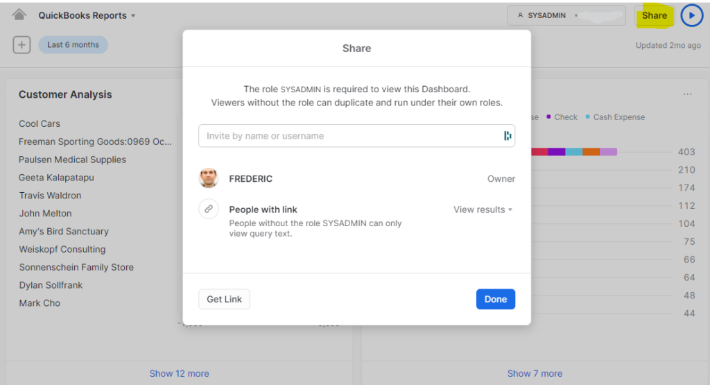
Another really cool feature enabled by the cloud is the worksheet history: every version of your SQL script is automatically logged once you run it and the full history is available from a drop down:
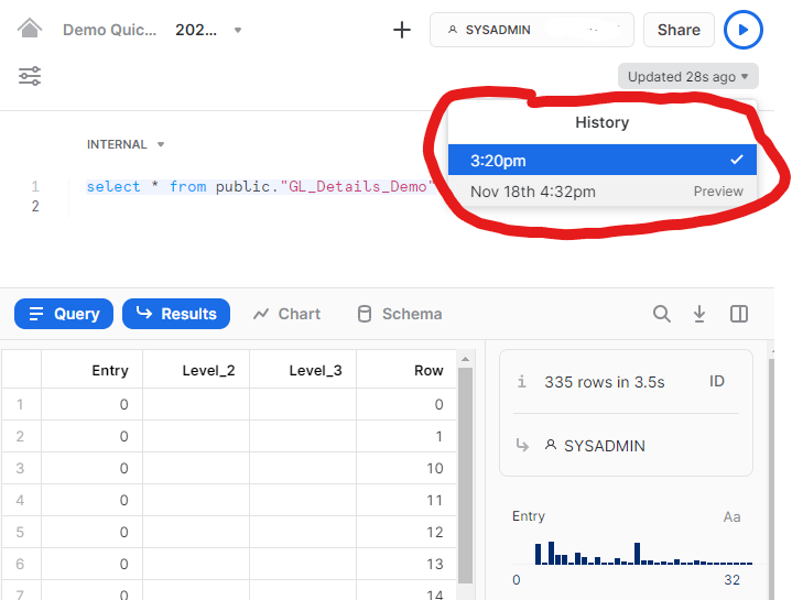
I think that is a perfect application for the Time Travel feature of Snowflake, and really accelerates development when I don’t need to worry about versioning anymore..
Another enhancement that might not be compelling to the majority of users, but VERY compelling for users like me surfing all day among various Snowflake customer instances: there is now a built in Account Switcher!!
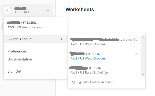
This should reduce, a bit, my browser tabs chaos…
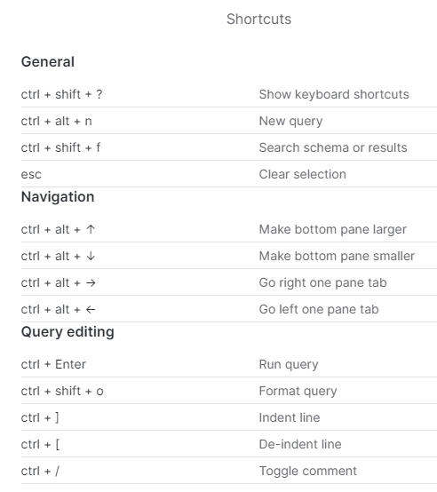
And as a last bonus, we are getting a nice set of keyboard shortcuts:
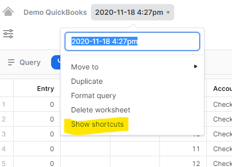
Access the up to date list in that menu:
Overall, even as a preview, this is already a very solid addition to Snowflake and should contribute to keep Snowflake way above the competition…
