Faster field name edits in Alteryx

From a distance, editing field names might not seem such a big issue, worth dedicating a blog post. Yet, I realize how much experience I gained over time, dealing with such minor issues, which end up affecting my productivity significantly over time. In other words, consider each time you draft a new workflow in Alteryx, and you will realize that, whether you deal with long SFDC tables with __c names or other naming conventions that leave to be desired,  you get to rename fields a lot. And you most likely have not had the best experience along the way. Read on as I will share some productivity tips and warn you about potential issues, especially in INDB.
Continue reading

Posted in Alteryx, Performance, Productivity, Redshift, Snowflake | Tagged , | 1 Comment

Weird query results on Snowflake

If, when you use Tableau or Alteryx to query a Snowflake Database, you are getting weird $ amounts, not matching what is the database, you are experiencing a known bug in the recent versions of the Snowflake ODBC driver:

https://support.snowflake.net/s/article/Regression-in-ODBC-v2-16-4-v-2

This is a big issue affecting floating number columns. Fortunately, it has been addressed with the release of ODBC Driver version 2.16.7 in August:

https://support.snowflake.net/s/article/client-release-history

Make sure you update your ODBC driver as soon as possible!

Here are the instructions:

https://docs.snowflake.net/manuals/user-guide/odbc-download.html

Posted in Alteryx, Snowflake, Tableau | Tagged , | Comments Off on Weird query results on Snowflake

How to analyze easily Google Search Console data in Tableau

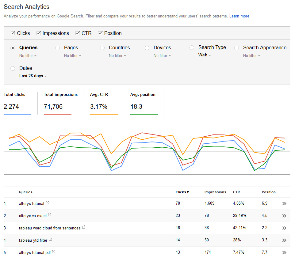
Whether you are deeply versed in the intricacies of SEO, or simply curious to optimize your web property’s organic search performance, you must likely are involved with the Google Search Console and its analytics. It is a very useful (and free!) tool to understand how users reach your website through a Google Search, and will help you ground your intuitions with facts: diagnose traffic and search position changes, find opportunities for optimizations and content ideas. Must Have for webmasters and digital marketers. If you want to learn more about your site’s traffic and any SEO health issues that it may have then this SEO checker is the ideal tool for you – https://www.ninjareports.com/seo-checker/. This will help you devise a strategy for increased success with your site. This sort of analysis can give you a visual representation of your site’s metrics and performance. Here is how it looks like for the very blog you are reading:
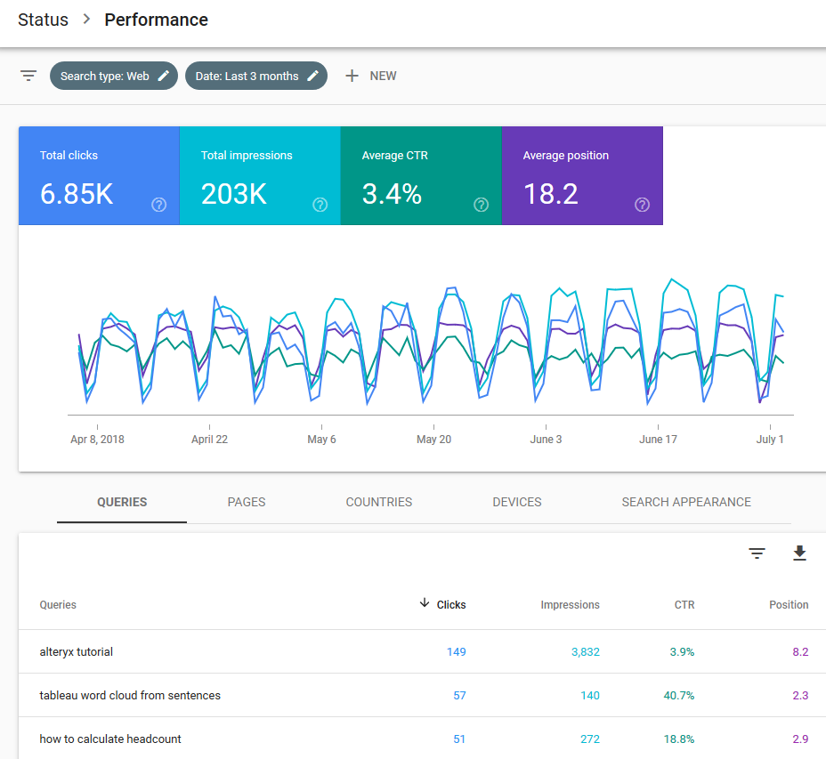
It even comes now with a fresher look and better filter ergonomics:

That new version lets you access up to the last 16 months worth of data, all the way until today-2 days. The legacy version was offering only 90 days. Each transaction is structured around 7 dimensions:

  1. Date
  2. Query
  3. Page
  4. Country
  5. Device
  6. Search Type
  7. Search Appearance, of little use

and 4 indicators:

  1. Impressions: How many times was the web page served into the displayed results of the Google Search
  2. Clicks
  3. CTR: Click Through Ratio calculated from Clicks/Impressions
  4. Position: How high on the Google Search results page did the page appear

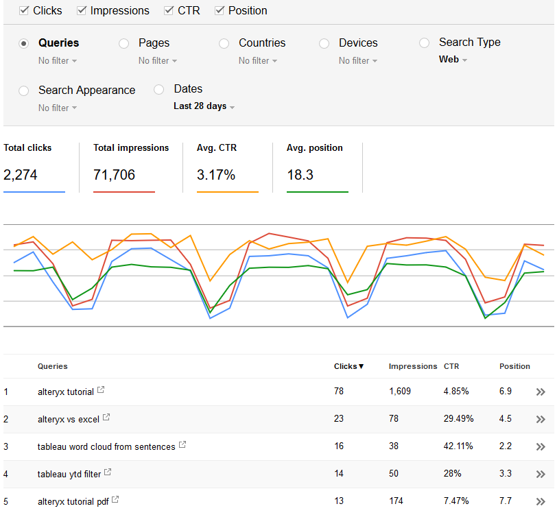
Overall the Web UI is decent and responsive. Alas, it suffers from grouping and sampling issues, just like its Google Analytics peer. Let’s take an example: you can’t display a list of all the keywords in Search Analytics and their corresponding landing pages. You would have to filter query-by-query to see their associated landing pages, or page-by-page to see their queries. Here is an illustration of my top 5 Queries:
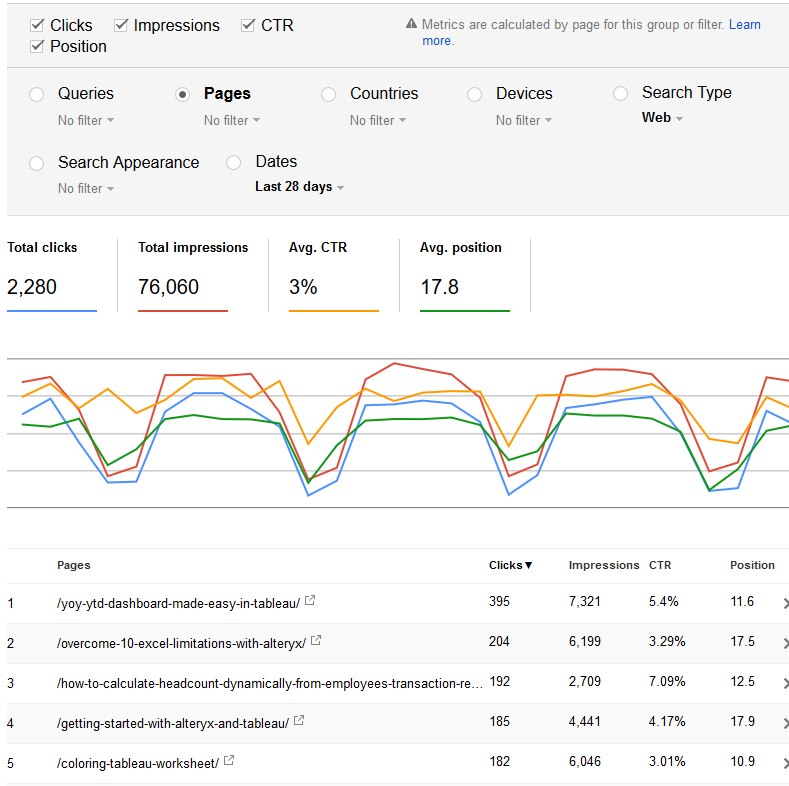
And now my Top 5 Pages:
But impossible to get the pages for my top 5 queries…

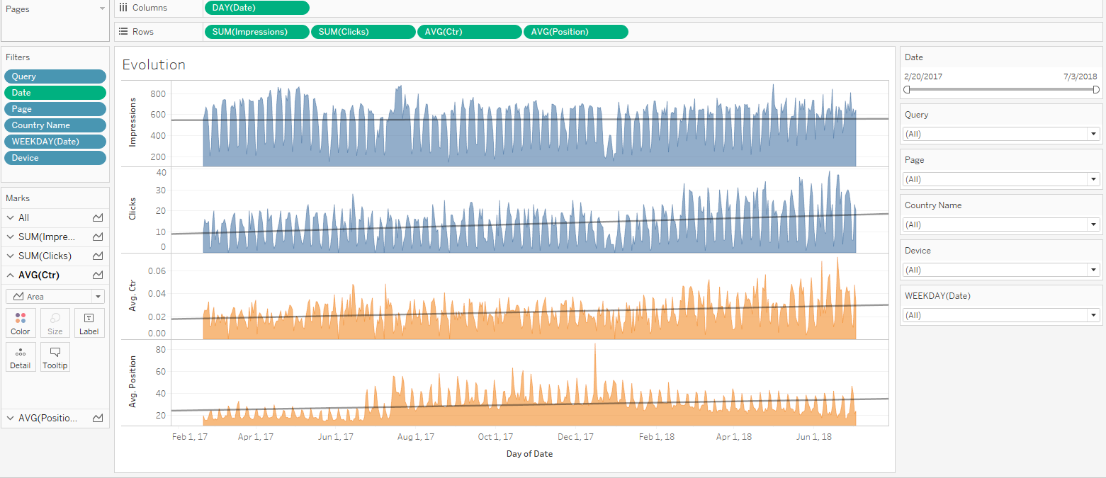
This sounds like a mission for Tableau:
I can then get all the features of Tableau to build whatever I need with the whole 16 months of data, that I can stockpile going forward:

Achieving that type of view requires to feed Tableau with good transaction data, out of the Google Search Analytics API (GSA API for short). That API will give us full control over filters and grouping, and we will be able to avoid sampling as well, since we won’t group by page : “When you group by page and/or query, our system may drop some data in order to be able to calculate results in a reasonable time using a reasonable amount of computing resources”. The strategy we will follow is to make one call by day, as detailed here. There are 2 ways to get the data to Tableau. we will cover the quick & dirty approach through Google Sheet, appropriate for a one shot analysis, and the thorough approach through API in Alteryx, appropriate for long term operations.
Continue reading

Posted in Alteryx, Marketing, Tableau | Tagged , , | 2 Comments

Unboxing Tableau Prep 2018.1

A year and a half after the first demo of Project Maestro, Tableau has finally released his latest product: Tableau Prep.

Tableau Prep is positioned as a standalone tool to “combine, shape, and clean data for analysis”. That puts Tableau Prep squarely in the same category as Alteryx, whose core functionality is data prep. The twist with the launch of Tableau Prep is the pricing strategy: it looks like Prep is bundled with existing Tableau Desktop & Server licenses and subscriptions.

Why is Tableau bundling a separate product for essentially free? Why not incorporating the Prep features into the core Tableau Desktop experience, if Prep is not intended to generate a new line of revenue? My pure speculation is that at that stage, Prep as a V1 is not ready to stand on his own, and is still too weak to prevail in competitive situation. It will eventually mature into a solution worth paying for, but today, it is still too limited. I have been kicking the tires and will share my first impressions and hopefully justify my assessment.

Continue reading

Posted in Alteryx, Tableau | Tagged , | Comments Off on Unboxing Tableau Prep 2018.1

How to compare your customers by visual cohort chart

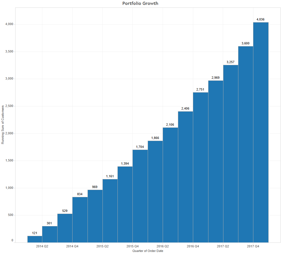
When trying to get a better grip on the performance of a large number of customers (or accounts, or pupils for the matter), and  progression over time of their count, their revenue  or their conversion from one status to another, it really helps to organize them in cohorts, to compare them fairly.  Namely, you would want to compare the 2017 revenue generated by customers who have been transecting since 2014, with the revenue of those who transact since 2016, as they are at different stage in their customer journey, hopefully. For illustration, the Tableau SuperStore data set has 793 customers and 5,009 orders over 4 years:

From that perspective, the growth of the number of customers looks steady and healthy, but is it really? Are we acquiring customers in 2017 as we did in 2015? Critical details, such as the number of orders per customers are buried within that mass of data.

A better angle would be to depict the progression of those customers by cohorts, taking for reference the date of their first order to group them, and plot how are they growing in subsequent years.

Continue reading

Posted in Marketing, Performance, Sales, SFDC, Tableau | Tagged | Comments Off on How to compare your customers by visual cohort chart