
Many business dashboards track headcount figures, since it is quite a vital indicator for most organizations. Conceptually, headcount is a straight forward concept. Technically, it is actually very complex to render for analysis, as it should not be stored, but calculated for a set of circumstances: Time, employee role, location, gender,etc. The question is, how do we present this data? Many businesses will flock to a data visualization site, like this online histogram maker, to present data like this.
Headcount is indeed very close technically and conceptually to inventory management, with flows of employees coming in and out the organization, and the required snapshot of where it stands It can also be used to see if improvements can be brought in to help motivate employees (such as the https://www.blueboard.com/blog/top-16-experiential-rewards-to-promote-employee-wellness systems that have started to appear across many industries). Headcount computing can be also compared to the approach needed for ROI calculation, as addressed in one of my previous posts. At a higher level of abstraction, a very good read by Keith Helfrich is diving into the similarity of those data sets. However, whereas Keith is using Custom SQL and Table Calcs in Tableau to reshape the data, I will take the Alteryx route, which I find cleaner, easier to explain and document.
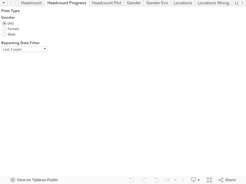
I can get to this very dynamic way to report on headcount:
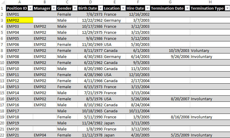
Now, how to get there? Let’s start with the source data: a set of transactions records for each employee, that you can download from here, looks like this:
We need to reshape that data before we load it into Tableau, so that we can count at any point of time how many employees are active in the headcount:
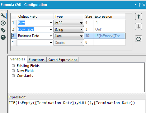
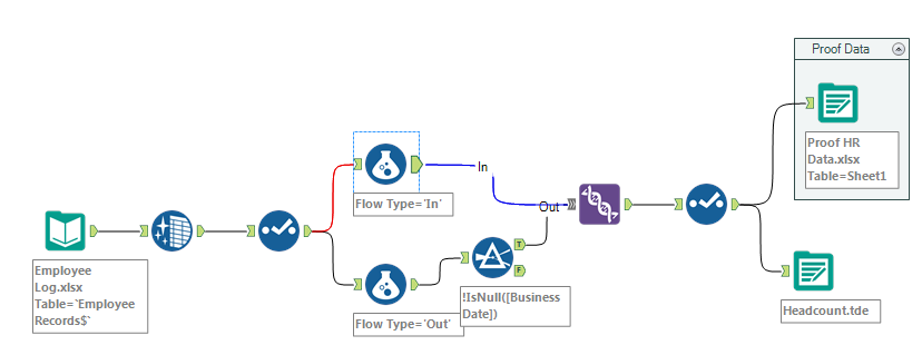 The approach consists in processing the hires as positive additions to the headcount using these formulae for the inflow (=hires):
and creating additional new entries for the outflow (=terminations) of employees which will decrease the headcount only after the terminations occur:
After running the workflows, the data will look like this:
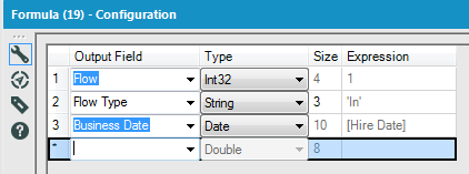
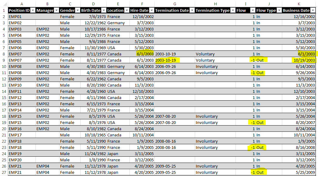 Note how the business date is using hire date for inflow, and termination date for outflow. Furthermore, the granularity of the transactions increases:
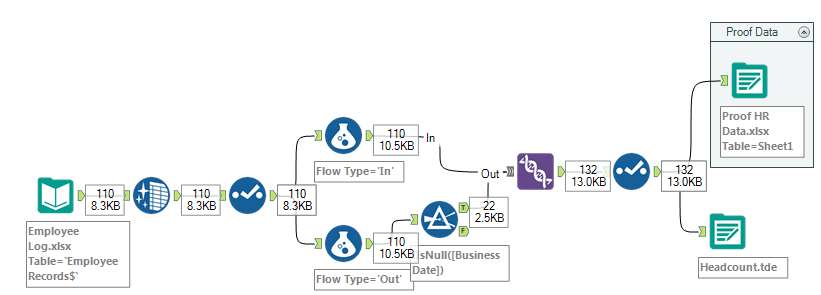 I start with 110 employee records, and add 22 terminations to end at 132 rows loaded into Tableau.
In Tableau, I need a couple of calculated fields to get the dynamic headcount and various additional relevant indicators:
Headcount = Running_Sum(sum([Flow]))
Hires/Arrivals = if [Flow Type]=’In’ then [Flow] END
Terminations/Departures = if [Flow Type]=’Out’ then -[Flow] END
Departures Voluntary = if [Flow Type]=’Out’ and [Termination Type]=’Voluntary’ then -[Flow] END
Turnover = sum([Departures])/[Headcount]
Tenure in Days = DATEDIFF(‘day’,[Hire Date],iif(isnull([Termination Date]),today(),[Termination Date]))/365
Tenure in Years = DATEDIFF(‘year’,[Hire Date],today())
Age = DATEDIFF(‘year’,[Birth Date],today())
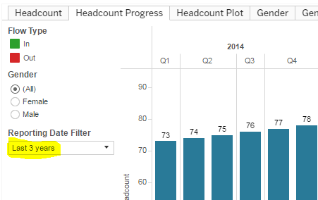
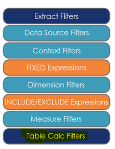
Now there is an important additional modeling challenge to address: headcount being a Running Sum table calculation, it needs the full history of employee records since the beginning of the organization, or at least a starting point, which is most likely further in the past than your visualization would require. In other words, if I am reporting on Microsoft headcount, I do not necessarily want to display the headcount all the way back to 1975, the last 2 or 3 years are usually what is relevant to display. The challenge is that if I add a filter on Business Date for the last 3 years, my headcount will be wrong, counting only the flows happening over the last 3 years. Hence the need to create in Tableau an extra Reporting Date Filter filtering the Table Calcs without filtering Business Date:
 Now if you have been following my posts, we are entering with this filter what I have been calling Tableau post wall territory in terms of complexity, so buckle up!
First things first, it is important to understand in which order the Tableau engine performs calculations. As Bora Beran explained in his blog, Table Calcs like Running_Sum are performed last:
 That works well for our purpose, now which formula to use? That good old Lookup() Jedi Trick:
Reporting Date Filter = lookup(max(([Business Date])),0)
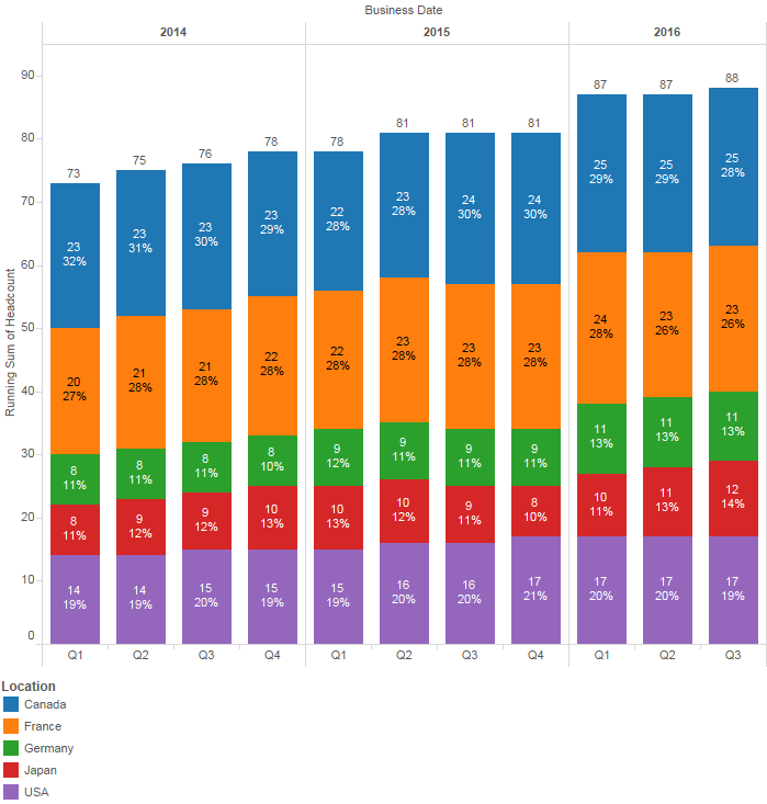
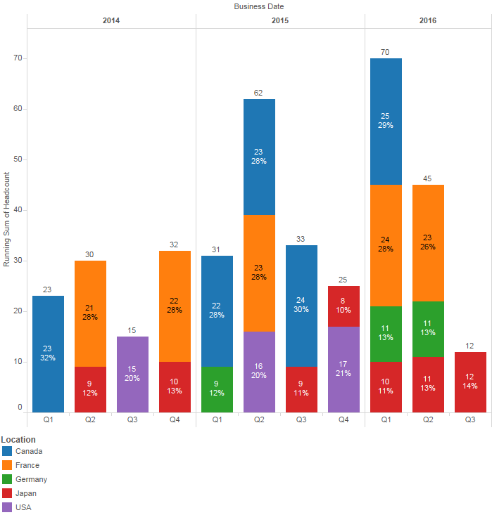
This is simple to implement, and will work really well for most purpose, like on the Headcount or the Headcount progress tabs above, because the data underlying is dense enough, that is you have at least one entry per business date month. However, should you need to display a data set not dense enough, such as headcount per location per quarter, as illustrated by the Locations Wrong tab above, all hell breaks lose, and instead of getting this:
 You are instead getting this:
 It took none other than Joe Mako himself to help me find the proper formula that does address this data densification issue:
Reporting Quarter Filter = DATE(DATEADD(‘quarter’,INDEX()-1,DATETRUNC(‘quarter’,#First business date in your dataset#)))
Make sure you check Show Missing Values from the Quarter drop down options. If you want to push further your understanding of data densification issues, beyond the purpose of this blog post and at the frontier of my abilities, I highly recommend this material put together by Joe, in Jedi Master territory. Thanks again Joe!
Here are the links to the Tableau Viz, the source data, the proof data, and the workflow used in this demo.
Hi,
Kindly advice how you have calculated “Flow” fields. I am not able to identify the tool in above snapshot.
Thanks
Flow is simply a counter that has a value of 1 when type=in and -1 when type=out
I am trying to recreate the headcount tab and getting an error message when I drag the “Reporting Date Filter” into the filters area and add the last 3 year filter. Error message, “The calculation ‘reporting date filter’ can’t be applied to a user defined aggregate.” Please send me more detailed instructions.
Thank you
Hi,
Have you downloaded the sample files and followed each step of the way? You must have missed a step, and without seeing your Tableau workbook, it is hard to identify which…
Hi,
I’m encountering the same problem. I downloaded your Tableau workbook and created another calculated field with the exact same formula as “Reporting Date Filter” but when I use this new calculated field I get the same error as Sandy Shapiro above. I’ve been stuck here for around half an hour now…
Thanks for the help! 🙂
Hello, it’s me again. Not sure if you’re still accepting comments here. I figured out what was wrong. When you create the field you have to convert it to a discrete measure. That solved my problem. Thanks for this tutorial; it looks easy but there’s a lot going on under the hood. 🙂
yes, a lot of calcs under the hood…
Glad it worked out though…
Happened to me as well. Let me know if you figured out how to solve the issue
Hi, Frederic
Great post.
I’ve tried to copy the way you did in your post for my headcount project.
I’ve encountered some problems.
When I try to show last three years’ gender evo with bar chart (color by gender), male values disappear in the years which don’t have any male flows and total headcount shows wrong.
However, when I try to show last three years’ gender evo with bar chart(not colored by gender), total headcount shows true.
What may be the problem?How can I show the true gender distribution with true headcount number?
Thanks in advance.
Hi Kursat,
You are facing the data densification problem I address at the bottom of that very post. make sure you read in details the part that starts with: “Now if you have been following my posts, we are entering with this filter what I have been calling Tableau post wall territory in terms of complexity”. You will see that you need to use a dedicated reporting quarter. You can also download the workbook I posted on Tableau public to see the difference with that view by Gender called Gender Evo…
Thanks,
I missed it. I solved the problem.
I want to ask you how can I show them in the dashboard using the reporting date filter. I could not make it global filter. How can I achieve this?
Thanks in advance.
Great article! I’m finding, however, that the data isn’t computing properly. We actually have 792 active employees right now but it’s showing 722. When I add up the “headcount” column, that results into 722, but when I run a report that shows a roster of active employees and I filter out anyone with a termination date, it shows me 792 employees. I’m not able to ascertain why I’m off by 70 employees. I’d love to send you the workbook to see what I’m talking about if you could help me. Thanks!
Looks like your data set is missing the “In” record (Entry stamp) for those 70 employees, hence the wrong total…
Frederic,
Thank you so much for this very enlightening, excellently explained, and clearly demonstrated example! Wow!
One question, though. The Tenure Dash and associated worksheets are showing all the same values for each worksheet – Tenure Bins, Tenure of Voluntary Terminations, and Tenure of Involuntary Terminations. Is that really correct? Seems wrong. Thanks!
Sorry, I am not sure I can see what you are describing?
Tenure sheet look fine to me here: https://public.tableau.com/profile/frederic.pinchon#!/vizhome/Headcount_7/HeadcountProgress
This is brilliant. I’ve tried to figure this out for a long time.
When I take your Locations worksheet from your workbook download and expand Quarter to Month, the dates shift from 2016 for 3 quarters to May 2007 through April 2008. When I put in the Reporting Month as filter, I get all of the days and it looks good. When I try to filter it down to any shorter period, the older periods disappear with the exception of Japan and the monthly flow is distorted.
I want to do my report by month because of seasonality, but when I drag the Location to Color I suffer from the densification problem. My total does not equal my grand total for the month. There must be something I am missing in the Filter formulas but I’ve proofed them all. Is it something to do with the parameters?
Hi Jose,
In this case, like often in Tableau, trial & error is your friend…
I was able to make your scenario work by:
1. Duplicate the locations tab, rename it to location by month
2. Expand the Business Date Quarter column to Month
3. Replace Reporting Quarter filter by Reporting Month
4. Tweak the Reporting Month Filter table calc, use at the level: Location, then set the filter to past 5 years and it works…
Amazing – this is exactly what I was looking for. At first I dismissed your solution but then realized 2 weeks later that it’s exactly what we needed
Thank you for this information/solution! We currently have a tool similar to this, with more workflows, approvals, date constructed using SharePoint. That said, has anyone built something similar using a different toolset? We are in the early stages of investigating MS Power Automate, Power Apps, PowerBI, Flow etc to rebuild/migrate our current tool. Has anyone else done this yet or something similar yet?